Your `:focus` state doesn’t have to be pretty. It just needs to work.
Topics
Design, DevelopmentLet’s get focused.
I often see developers misusing CSS :focus styles because they either don’t find them useful or don’t like the way they look. I agree that the browser default focus styles aren’t the prettiest, but they don’t need to be. A focus style is a style used to clearly show that an element is focused. It should not be subtle. It should not be ‘clean’.
In this article we’ll take a look at why it’s important to give your users a visual indication that an element has focus, and how to do it.
What is the focus style?
The focus style is a style that is applied when an element has focus.
The focus style can be defined by the user agent or by the developer. It is recommended that developers set their own focus styles, as this ensures consistency across a website and avoids possible conflicts with the user agent’s default. To do this, use the :focus pseudo-class selector.
:focus {
  /* styles here */
}
The :focus pseudo-class is supported by most browsers. The small number of browsers that do not support it will apply a default focus style (often a dotted outline) instead. This ensures that your site works for all users.
Why is the focus style important?
It’s important to highlight elements that have focus because it helps your users understand where they are at in your site.
If an element has focus, it means it can accept input. This means you should be able to interact with that element in some way.
When your users move their cursor to a different element, the element that previously had focus should no longer have it. This means that they should immediately notice that the element has lost focus. If they don’t notice that the element has lost focus, they might think that they can’t interact with it anymore and will move on, leaving your site without completing their task.
Focus styles help your users see that they can interact with a specific element.
What are some good examples of focus styles?
Don’t get me wrong. There are a lot of good examples of focus styles, but I want to show you what I consider good examples.
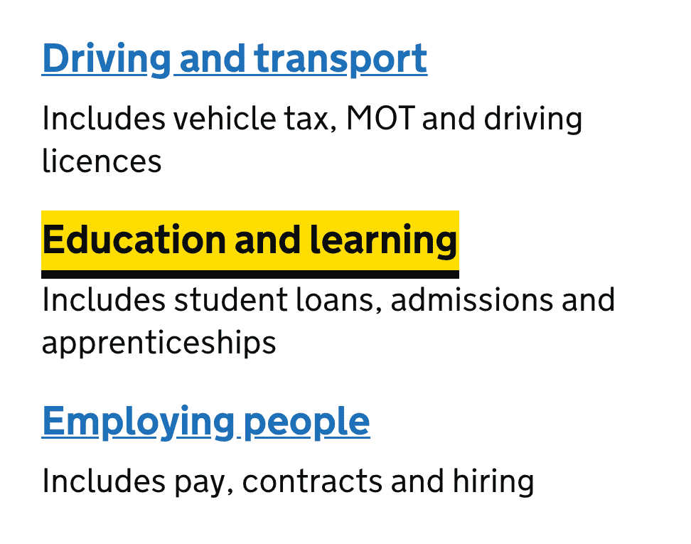
One of the best examples is the way the <input> focus styles work on the GOV.UK website. See the demo here.
Take a look at the Uk Government’s website, and hit tab.

See how the input that has focus has a nice outline and a thick border? That’s a good focus style. It’s clear and distinct.Their links are set in a shade of blue, while their focus state introduce black text on a yellow-banner background. Perfectly legible.
There are a lot of other focus styles on the web that are good examples, but I hope I’ve shown you the point I’m trying to make with these examples. Focus styles should be visually distinct. They should be immediately obvious. They should stand out.
What are some bad examples of focus styles?
There are a lot of bad examples of focus styles on the web.
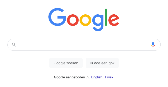
Let’s look at the most used input element on the web: Google’s search box. This is what it looks like:

And this is what it looks like when focused:

It looks exactly the same, except for a cursor appearing, but that’s default behaviour… On the contrary, the default browser focus styles on text inputs are a thin outline and a thin border. This is the default for a good reason. The default focus style is subtle and unobtrusive. It’s there, and it’s clear, but it doesn’t detract from your design. That’s what the default focus style is for.
Why do I think the default browser focus styles are so good? Because they don’t get in the way. They don’t distract you. They don’t pull your attention from the content. They exist to do one job, and they do it well.
So, if you want to create a focus style that isn’t the default, repeat after me:
Focus styles should be visually distinct. They should be immediately obvious. They should stand out.
So, those are my opinions on focus styles. But, what are yours? Shoot me an e-mail or hit me up on Twitter and let me know what you think!
[work in progress]