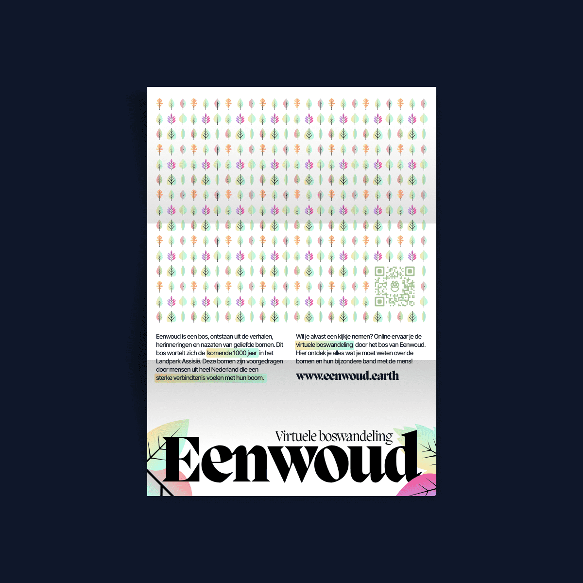
An immersive online representation of a forest full of stories, made to last a thousand years.
Responsibilities
Concepting, User research, Visual design, Interaction design, DevelopmentIntroduction
A forest, created from the stories, memories and descendants of beloved trees will take root in Landpark Assisië for the next 1000 years. These trees have been nominated by people from all over the Netherlands who feel a strong connection with their tree. Artist Lobke Meekes brings this idea together as “Eenwoud” (One Forest).
Lobke Meekes, the person behind Eenwoud, provided data and the written stories of those involved. In these stories you can read and feel how strong the bond is between man and tree. Emotions therefore play a big role in Eenwoud.
Concept
With the concept of ‘a virtual walk through the forest’, the choice was made to immerse readers into these stories and emotions. The idea behind this is that the readers can also experience these emotions themselves. This was created by analyzing the written content encoding it visually—which I’ll touch on later.
On the home page of the site, the user sees a floating island called Eenwoud. This was chosen to show that Eenwoud is a self-contained ecosystem. The island ‘sinks’ back down to Earth, as it were, where it once again becomes part of the bigger picture.
When the island has landed, the map of Eenwoud appears. This means that the forest walk can begin. The visitor can pick a route or a separate tree to start the experience. To make sure that they really feel like they are walking through a forest, the website plays ambient background noise, much like you would hear in a real forest. This can of course be turned on or off at any time.
One of the main goals of Eenwoud is to make visitors more aware of the impact of trees on society and nature. Through informative data visualisations and interesting facts, the reader is made aware of the importance and role they play.
Art direction
At the beginning of the project, several mood boards were created to define the basic style. From there on, one style was chosen and later applied to the visuals. The virtual forest walk uses a captivating and colorful—yet uncluttered—style. This ensures that the complex data is presented in an understandable and intuitive way. The clean typography combined with the stimulating use of color smooth animation create a pleasant and engaging reading experience.
Content analysis and visual encoding
The stories written were full of emotion and passion. In most of the stories, the emotions were easy to filter out. To portray the Emotions visually, colors were assigned to each different emotion. This was later done with the themes of the stories as well. By mixing these colors together to form a gradient, unique color combinations appear that represent which emotions will be addressed.
These color gradients were eventually applied to the true-to-life leaves for each tree species.
Data visualisation
On the specific ‘tree’ pages, the choice was made to make the connection between humans and trees clear with the help of a number of different visualisations.
To properly show the scale of some of the trees, the first visualisation shows a ratio between the average height of a tree and that of a human. This gives the reader a sense of how big trees can become and how small humans actually are.
Check out the live website (Dutch)
